Dispatch Mobile
I led the development of Despatch Mobile, a comprehensive design system crafted for an IoT fleet management startup. The launch of this project enhanced consistency between design and development, streamlined the workflow of product designers, and established a robust foundation. We successfully crafted a flexible, modular, consistent, and scalable design system that met the needs of the business.

Role
UX Researcher, UX Strategy & UI Designer

Project type
Design System for Android tablet app

Team
4 Designers / 2 Devs

Contribution
Audit, research, design, and documentation

Tools
Android Studio, Figma, Zeroheight

Duration
7 months
Challenges
- The current UI Library was lacking consistency in its components, text, and color styles, resulting in multiple inconsistencies between design and development and perceptible UX and UI discrepancies in the final product.
- The lack of a defined design workflow made it tedious to repeatedly edit UI elements across various screens, and the absence of a centralized design system led to confusion among developers and further discrepancies in the in-production product.
Process
As the company experienced rapid growth, the development team was forced to release functionalities to meet business needs. As the first full-time designer brought on board, I was tasked with the responsibilities of updating the existing UI Library and working on the product. One of the most pressing needs was the establishment of a comprehensive design system to streamline the design process and improve consistency across the product.
1. UI Audit and inventory
I conducted a thorough review of both the UI Legacy design and the tablet app, side by side, capturing screenshots of the tablet to isolate and document discrepancies between design and development. The buttons emerged as the component with the most discrepancies, revealing a wide range of sizes, colors, borders, and fonts.

2. Research
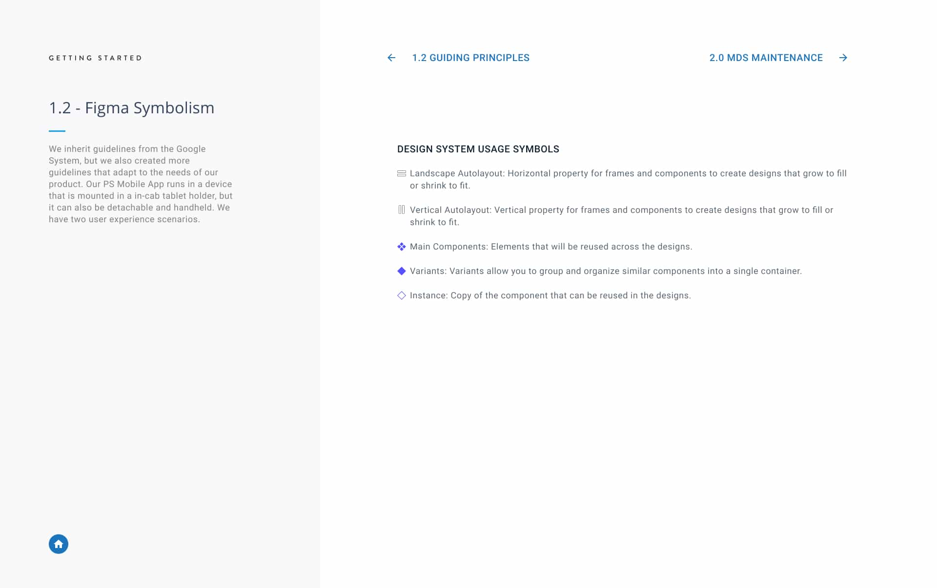
After completing the design audit, I delved into researching the latest best practices and tool functionalities in the market to develop an up-to-date design system. The release of new features such as auto-layout, master components, variants, instances, constraints, and styles in Figma revolutionized the way we approached designing user experiences and allowed us to elevate the design system to the next level.

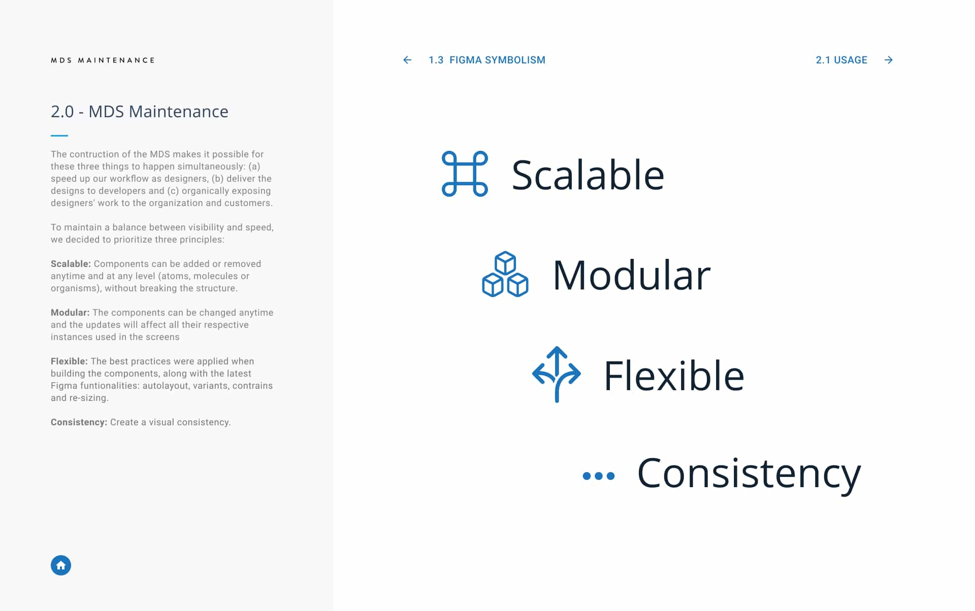
3. Principles and guidelines
To ensure a logical and organized structure for the components, I implemented the Atomic Design Methodology. As I worked on the design, I drew inspiration from Material Design, Android Auto, and Google Design guidelines to ensure that we were delivering a consistent and reliable experience for our truck drivers.

4. Structure
As the design system progressed, the complexity of the project required the creation of an information architecture diagram outlining the structure of the atomic components. This not only facilitated easy navigation within the system but also enabled quick and efficient identification of specific components.

5. Documentation
Standardizing component usage was a significant challenge both in design and development. To address this, I formulated a set of guidelines for each new component to provide guidance to the product team on when and how to effectively employ the components The buttons were categorized by relevance and the style was determined based on user cases identified during the research phase.

6. Adoption
After successfully crafting the design system, we created a plan for its distribution, adoption, and engagement. The most significant obstacle we encountered was raising awareness of the design system's benefits among the product team, as this was a new process for them. To overcome this, our team organized multiple demonstrations and provided Figma assets to assist in onboarding our product designers and developers. This documentation included the foundation, principles, and step-by-step instructions on how to effectively utilize the new components.


7. Training
To establish a sustainable design system, it was essential for the product designers who adopted it to learn how to contribute to its maintenance. To facilitate this, I organized multiple training sessions to teach my design team how to construct components, create documentation, and utilize the latest features in Figma. One of the most important updates was the inclusion of interactive components, which enabled designers for the first time to effectively communicate their desired micro-interaction specifications to developers.
Optimizations
 Leverage the legacy UI Library to create a design system.
Both developers and designers follow Android and Material Design documentation
Documentation from Figma to Zeroheight.
Set of guidelines established for future decision-making (New designers and devs)

Achievements
 Terminology standardization.
Establish color and typography styles.
Avoid misalignment from the design stage.
Create visual consistency.
Accelerate the UI process.
Synchronize transitions from the design stage to development.

Selected Work