Figma Governance & Analytics
AI-Powered Figma Governance
Who's actually using Figma? Who isn't? What are we wasting? I used Claude AI to build two interactive dashboards in under 2 weeks, giving Indeed its first clear view into Figma seat utilization. The analysis enabled a $54K/y savings recommendation, a clean data strategy for the Glassdoor license merger, and a foundation for ongoing cost optimization.
Role
Analytics Leader and Strategist
Project Type
Enterprise Tool Optimization
Team
Figma Strategic Working Group (3 members)
Contribution
AI-assisted dashboard development, data strategy, multi-org analysis
Tools
Claude AI, React, Recharts, CSV processing
Duration
2 weeks


The Problem
Indeed was approaching its April 2026 Figma contract renewal with zero visibility into how 1,025 paid seats were actually being used. The data existed, but it was hard to analyze:
- 5,700+ rows across multiple CSV exports
- Columns for names, emails, dates, seat types, activity timestamps, job titles, teams, JSON code
- Many layoffs left hundreds of unassigned seats
- Blind renewals = thousands in wasted spend on inactive seats
- No dashboard, no tooling, no way for a human to make sense of it
Added complexity: Glassdoor was merging their Figma license with Indeed's. Their data had to be analyzed alongside ours, without contamination. The Finance team needed a budget request in days, not weeks.
The Strategy
Claude AI can accomplish tasks that would take a human weeks to complete. I fed raw CSVs directly to it to ingest thousands of rows, parse complex date logic, and output data visualizations.
Why dashboards, not spreadsheets:
- Spreadsheets hide data patterns, dashboards reveal them
- Stakeholders needed to see utilization, not read about it
- Interactive filtering lets leadership explore the data themselves
- Visuals make the case for budget decisions
My approach:
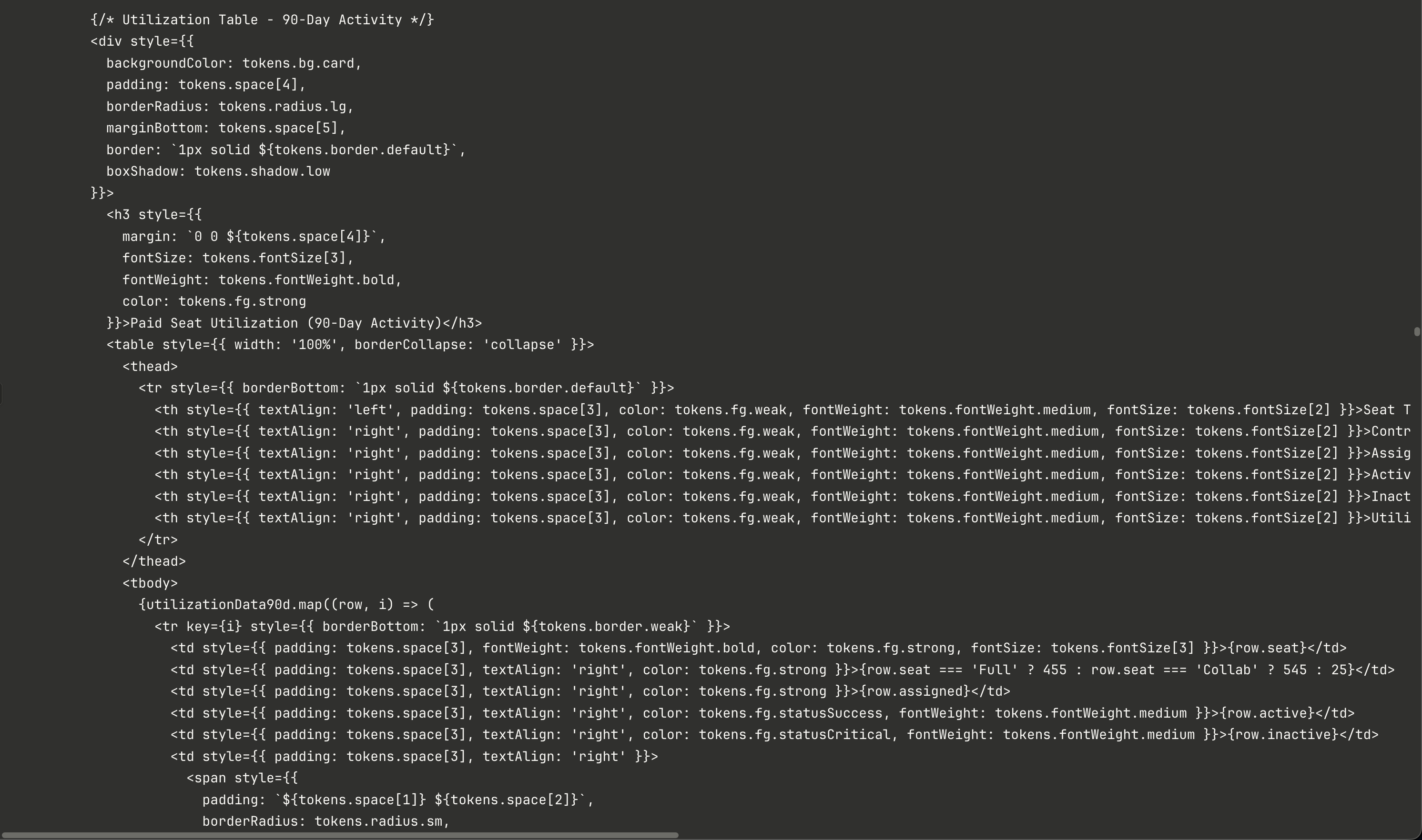
- Build React dashboards with live data — not static reports
- Create multi-org views (Indeed, Glassdoor, Combined) without mixing source data
- Make every metric traceable back to the source row

Two Dasboards, Two Weeks
I partnered with Claude AI to turn thousands of unusable spreadsheet rows into two interactive dashboards in 2 weeks, one showing seat utilization across orgs, one showing AI feature adoption by role. For the first time, leadership could see exactly where money was being wasted and make informed decisions about the renewal.

Dashboard 1: Seat Utilization
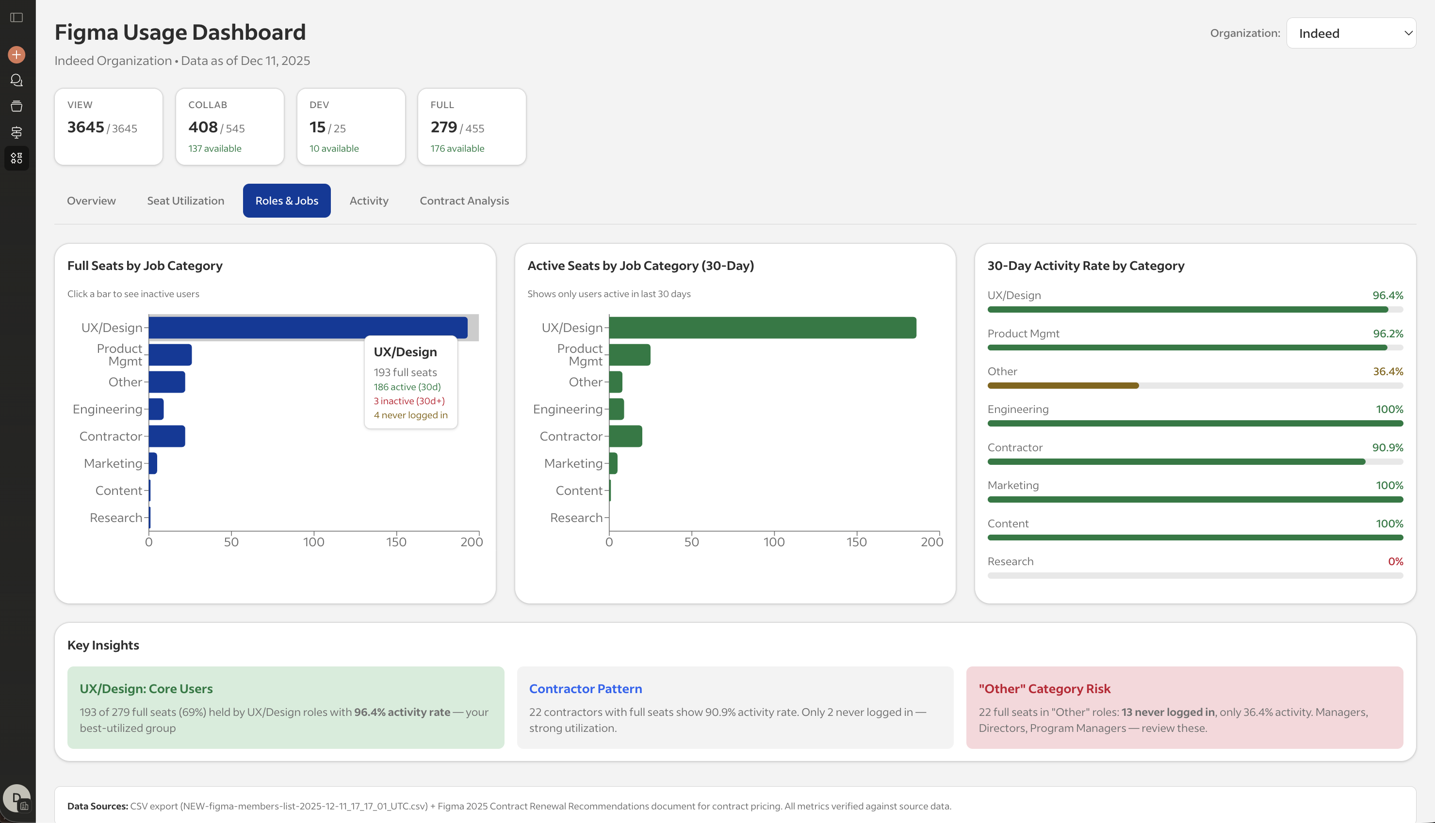
For the first time, leadership could see exactly which seats were active, which were dormant, and which roles were underutilizing their allocations. What it shows:
✓ Multi-org toggle (Indeed / Glassdoor / Combined)
✓ Seat breakdown by type (Full, Collab, Dev, View)
✓ Activity status at 30, 60, and 90-day windows
✓ Role category analysis (UX/Design, Product, Engineering, etc.)
✓ Clickable cards → modal with individual inactive users
✓ Duplicate account detection (61 @indeed.com emails found in Glassdoor)
Dashboard 2: AI Feature Adoption
Proved that AI investment is justified, but only for designers. Other roles aren't using it, which informed seat type decisions. What it shows:
✓ Top AI features by user adoption (Make, FigJam, Image AI
✓ Usage breakdown by role (designers = 87% of all AI usage)
✓ Active vs. inactive Make users (228 users with zero edit days)
✓ Key findings panel with renewal recommendations

Indeed + Glassdoor Integration

Glassdoor is part of the Recruit Group family. We received a special request to merge both our Indeed and Glassdoor Figma licenses to reduce 2026 tooling expenses. Merging Glassdoor's license data required a strategy to analyze both orgs without contaminating either dataset.
Glassdoor leadership received their own utilization data for the first time, which surfaced cleanup opportunities before the merger.
- Glassdoor had 466 members with different usage patterns
- 61 users had @indeed.com emails, potential duplicates
- Their seat distribution was inverted (more Dev seats than Full seats)
- Collab utilization was even worse than Indeed's (22% vs 45%)
- Separate data pipelines for each org
- Combined view calculated at render time, not at source
- Duplicate detection based on email domain matching
- Clear labeling of the data source in every view
Business Impact
The dashboards transformed a blind renewal into a data-driven negotiation with Figma. After gaining transparency on Figma license usage and submitting the budget request to the Finance team, we archived the following:
$54,420
2026 Annual savings (16% reduction from $340,500)
< 2 weeks
Time to build both dashboards with Claude AI
786 seats
Optimized allocation (down from 1,319 paid seats)
295
Cross-org underutilized seats flagged for cleanup

The Evolution Ahead
The real insight: the data was always there. We just never had a way to see it.
This project demonstrated that AI-assisted tooling can significantly reduce timelines that would otherwise require weeks of analyst work, but they're designed to become permanent infrastructure, not a one-time analysis.
Next phase - Automated Pipeline:
- API integration with Figma's admin exports
- Dynamic data refresh via automated pipeline
- Continuous utilization tracking, not annual snapshots
- Proactive alerts for inactive seats before renewal cycles
I design systems that both humans and AIs can understand, trust, and build on.
Selected Work